Envelope stamps

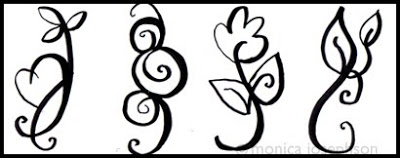
I’ve just finished some line art that I’m going to carve into stamps. After the stamps are carved, I’ll be able to decorate the envelopes for my card sets. I’m through with using store-bought stamps for my designs.
UPDATE: Here they are carved and stamped on paper. I like how the stamp material comes through the design with rough artifacts. They also look good on colored paper. I got the carving blocks from MisterArt.

MOO stickers


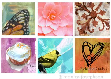
Here’s a collection of images that I had printed into stickers at MOO.com. They turned out great and I plan to use them as envelope seals for my cards. The cool thing about Moo is that they can print a sheet of tear out stickers with different images on each sheet. So fun!!!

Thank You card


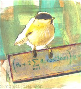
I made these cards for my sister to give out after she receives baby shower gifts. I work in layers of paint and paper and then combine illustrative or photographic elements for a soft, textured look.

Kayla

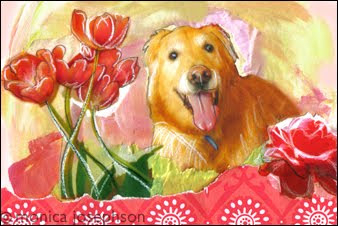
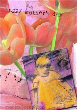
I’m doing some cards for a friend of mine who recently rescued a beautiful Golden Retriever from Homeward Pets. Here is the first of three designs. I started with photos that I took of flowers and then with some pictures of Kayla. I printed the images out on vellum to give them a softer look. I played around with collaging the paper images on a painted background and then scanned them. I think the cards have a sweet, vibrant look that matches Kayla herself.

Opal

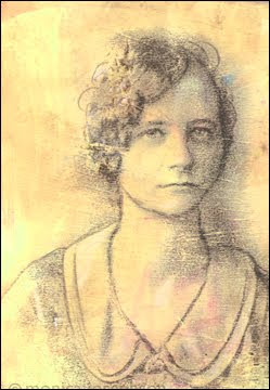
This lovely lady was transferred using an inkjet printed transparency that was rubbed onto a painted scrap of wood with a bone folder. I love how she came out looking like a delicate pencil sketch.

Jenkins and Bessie


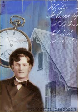
I made these cards for my cousin who does genealogy and has tracked our family over several generations. Her work is amazingly detailed and helps us all to understand the folks that came before us. She was also kind enough to give me lots of gorgeous vintage photos that provide a wealth of inspiration! Thanks, JF!!!!

Mixed Collage

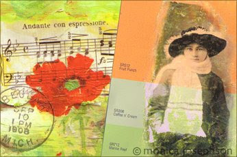
Mixed media using gel medium transfer on a paint chip sample from Home Depot. (Finally found something to do with all of those pretty paint samples…). Next I digitally pasted the paint chip lady onto another paper collage with sheet music and a napkin poppy.

IF- Hierarchy


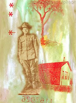
This piece came together as a series of happy accidents. The khaki and red colors speak to the military theme. The background is smeary like a dirty window or one that is streaked with rain. All that we know about this soldier is his numeric label which is backwards and nearly unreadable. Despite questionable barracks, this young fellow is fresh-faced and appears in good spirits. We can only hope for the best for him.